The IB Learner Profile Classroom Posters
Created by the International Baccalaureate, the IB is a set of attributes that rare essential to being a well rounded student. About 10 years ago I made a set of Learner profile posters for my wife’s classroom. That original set was so popular that I made them available in my Etsy shop, where they have been purchased by hundreds of teachers all over the world. Since then I have created a set of Key Concepts posters, Approaches to Learning posters, and an updated set of Learner Profile posters.
I had so match fun creating all of these posters, so when Dwight IB School in Dubai reached out to create a custom set for the using their lion mascot, it was a dream project. A huge thank you the Dwight School for getting in touch, a thank you to all of the teachers who have purchased these posters over the years.


Library Finds - part 3
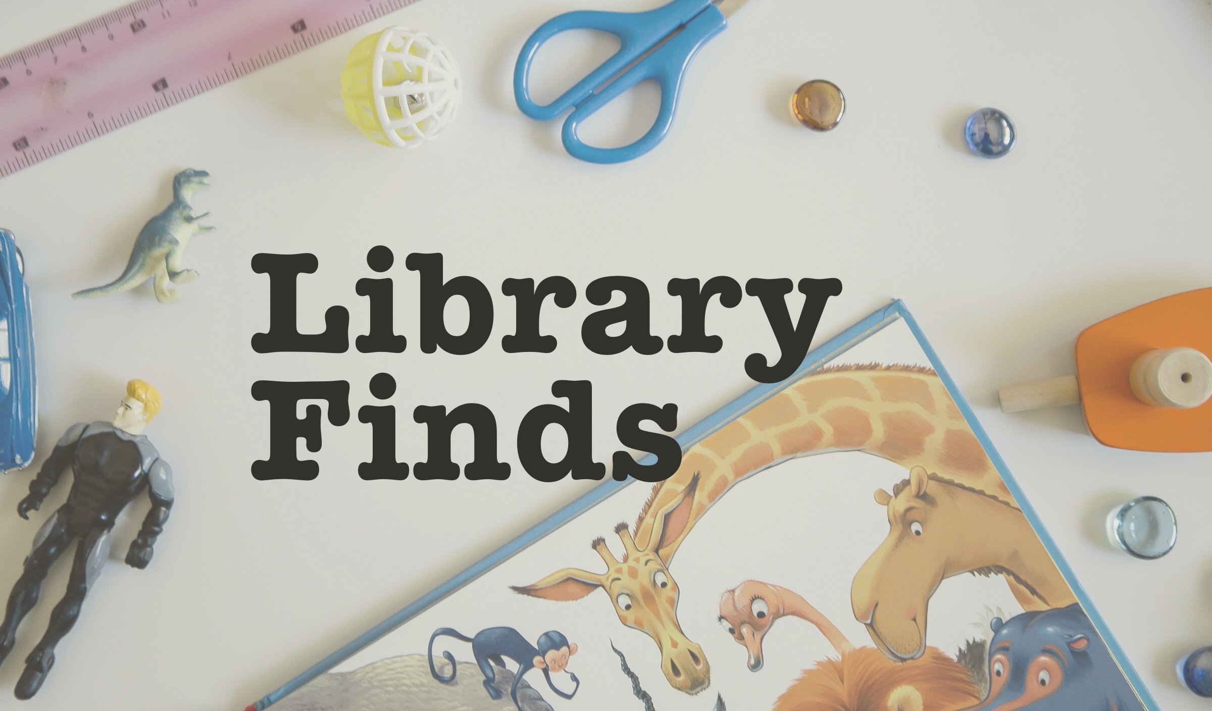
If you’ve ever walking into the children’s section of your local library and felt overwhelmed by the seemingly endless shelves of options, I’m here to help. As a children’s author and father of young kids, I spend a lot time looking through the books at the library, and every month or so I like to share some of my favourite finds, including what I liked bout them, why I chose them, and a little bit about the book itself.
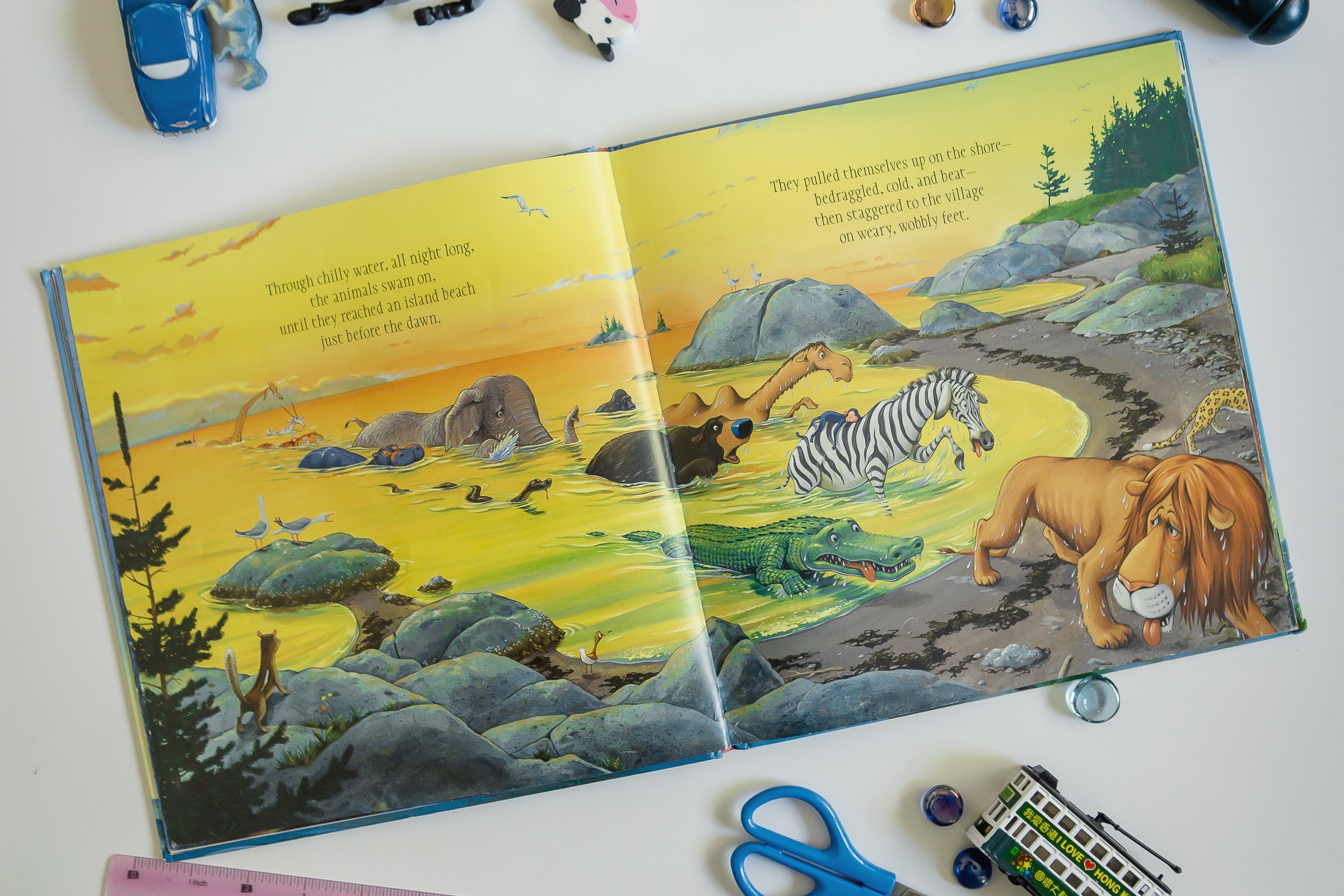
The Circus Ship
written & illustrated by Chris Van Dusen
Chris Van Dusen is one the most talented picture book illustrators out there. I picked this book because I selfishly love seeing his illustrations, but also because I know that pretty much any book with animals in it are going to be a hit with my 5 year old. ‘The Circus Ship’ did not disappoint. It’s a cute story about a group of circus animals who get marooned in a friendly community on a small island. When the circus’ mean ring leader come searching for his lost animals, the residents of the island help the animals blend into the surroundings, and they all live happily ever after. It’s a feel good story, and of course the illustrations did not disappoint.

Have You Seen Gordon
written by Adam Jay Epstein, illustrated by Ruth Chan
At a glance this may seem like your typical ‘find Waldo’ type of book, and although it starts off that way, it eventually evolves into a story. My kids and I both had a lot of fun reading this book, as there is a lot to look at, a lot to find, and it’s just plain fun. In the background there are a couple of side stories taking place, including an axolotl trying to steal the spotlight, and a horse that seems to have lost his pants. This is kind of book that you can easily flip through more than once.


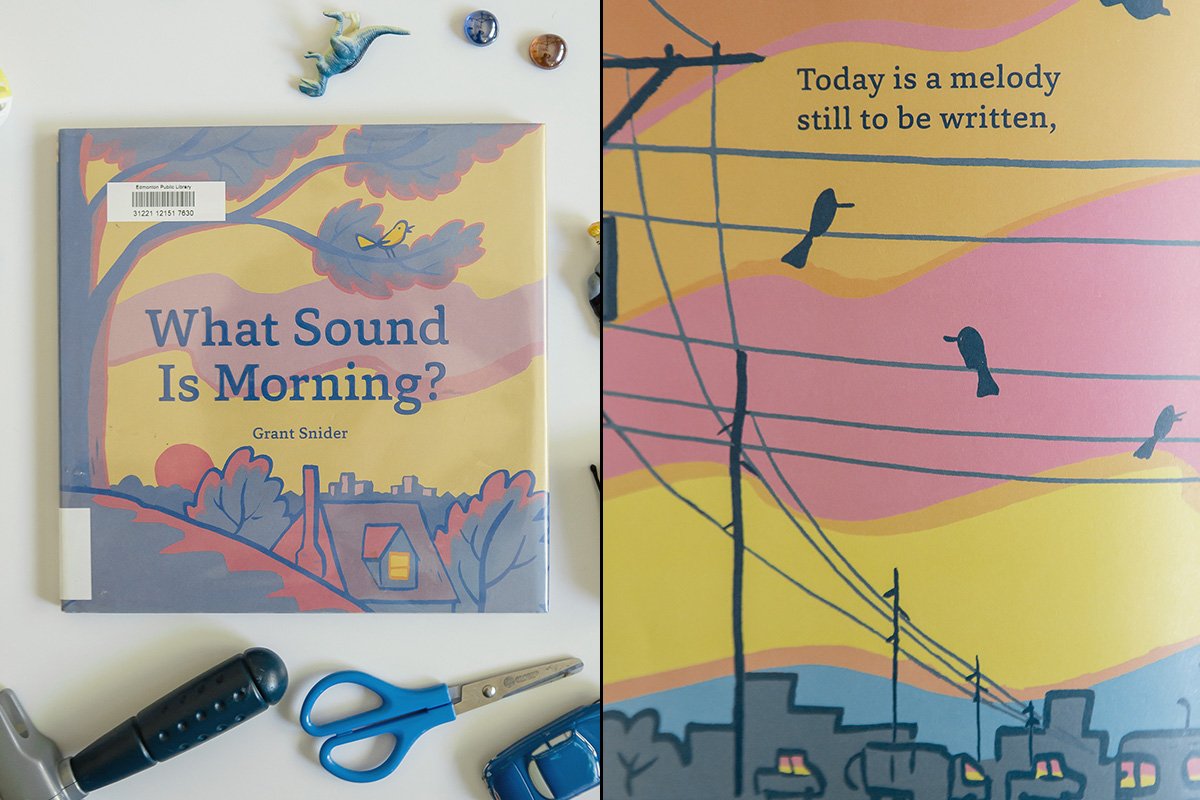
What Sound is Morning
by Grant Snider
The subtle illustration on the cover of this book was enough to draw me in, and with a quick flip I could tell that it would be a nice calming poem with beautifully soft illustrations to match; perfect as a second bedtime story before I turn off the light. It would be great wake up early in the morning and take in the sights and sounds as the community wakes up, but life is busy and we don’t always get to see and appreciate these quiet moments. I love books like these take us to these places and moments and remind us to see the beauty around us.

What Do You Do With an Idea
written by Kobi Yamada, illustrated by Mae Besom
Picture books have the ability to express so many different ideas in so many different ways, and I love that coming home with a stack of books that cover a spectrum of the human experience. ‘What Do You Do With an Idea’ is a visually stunning book about a young boy who is unsure about a little awkward idea he has, but learns to embrace it’s weirdness. Younger readers might not feel as engaged with the text, but it’s worth checking out.


Socks
written by Elizabeth Lindsay, illustrated by Nick Sharratt
This book is from our personal collection, and it’s one of my favourite books to read. In this story we join two kids as they explore a world of socks, filled with an easy to follow rhyming scheme and lot’s of kid friendly puns. It’s short, cute, and fun, and it’s also a great example of how illustrations don’t have to be overly elaborate to be effective.


IB Learner Profiles Posters
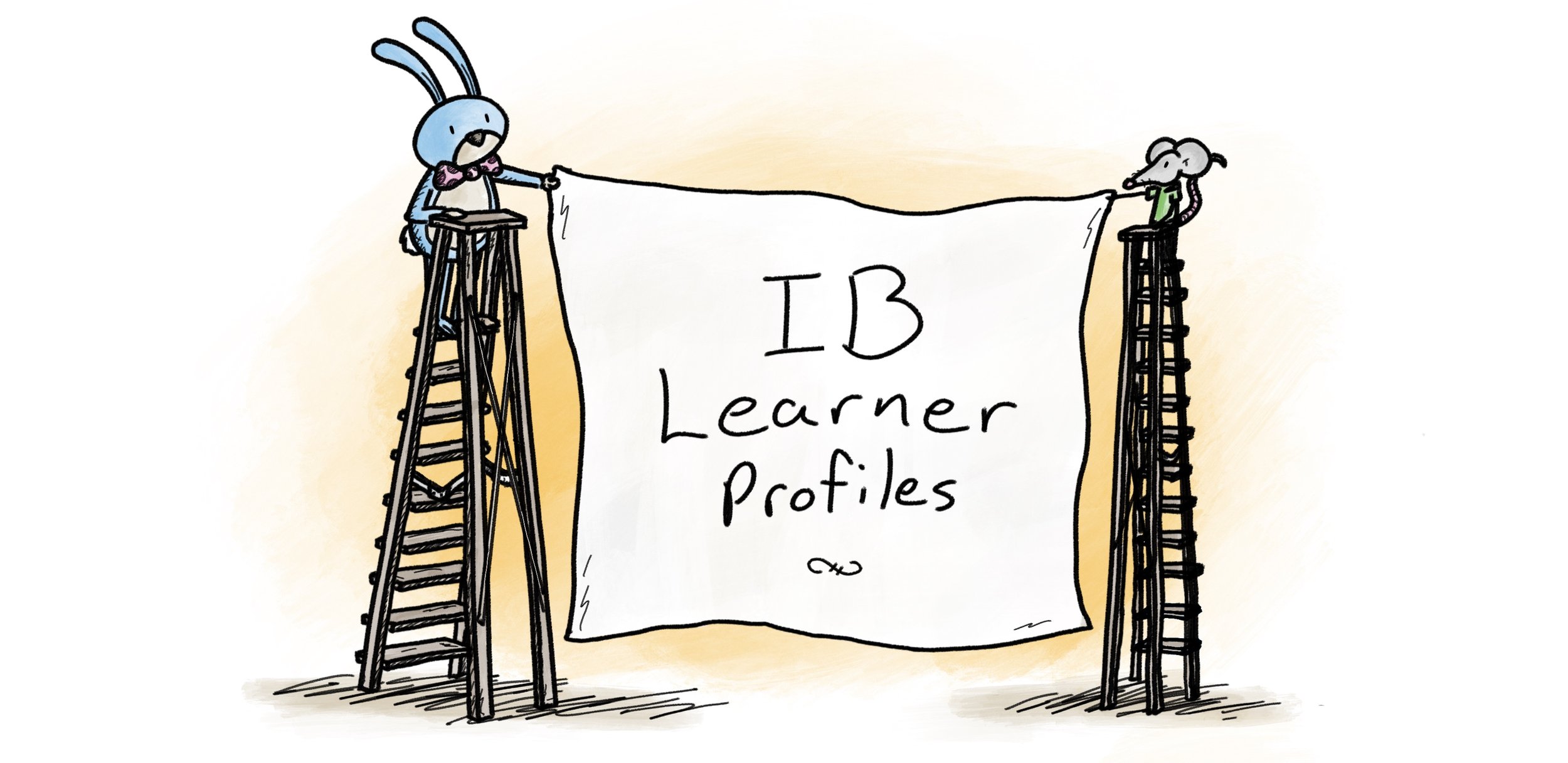
The IB Learner Profiles are a set of ten attributes that are universally make up well rounded people. These are values that the international baccalaureate fosters in their students.
Years ago I drew a series of posters for my wife’s classroom, back when she was a teacher, based on the IB Learner Profiles. A few weeks later I put the posters on my online store as printable downloads so that other teachers could print their own copies. Many years later, and now my posters are in IB classrooms in schools around the world.
That first set was made so long ago that I decided to create a new set, so here is the 2022 Land of Le Beef IB Learner Profile poster series:

Balanced
Life can be a balancing act, and our well-being often depends on our ability to navigate the different aspects of the world that affects us.

Inquirers
Let’s research, let’s ask questions, let’s explore, and let’s learn. Let’s be curious, and let’s wonder.

Knowledgeable
It’s so easy to skip across the surface of knowledge, but if we take the time to explore concepts and ideas of issues that are significant to us, we acquire a deeper understanding across a broad and balanced range of disciplines.
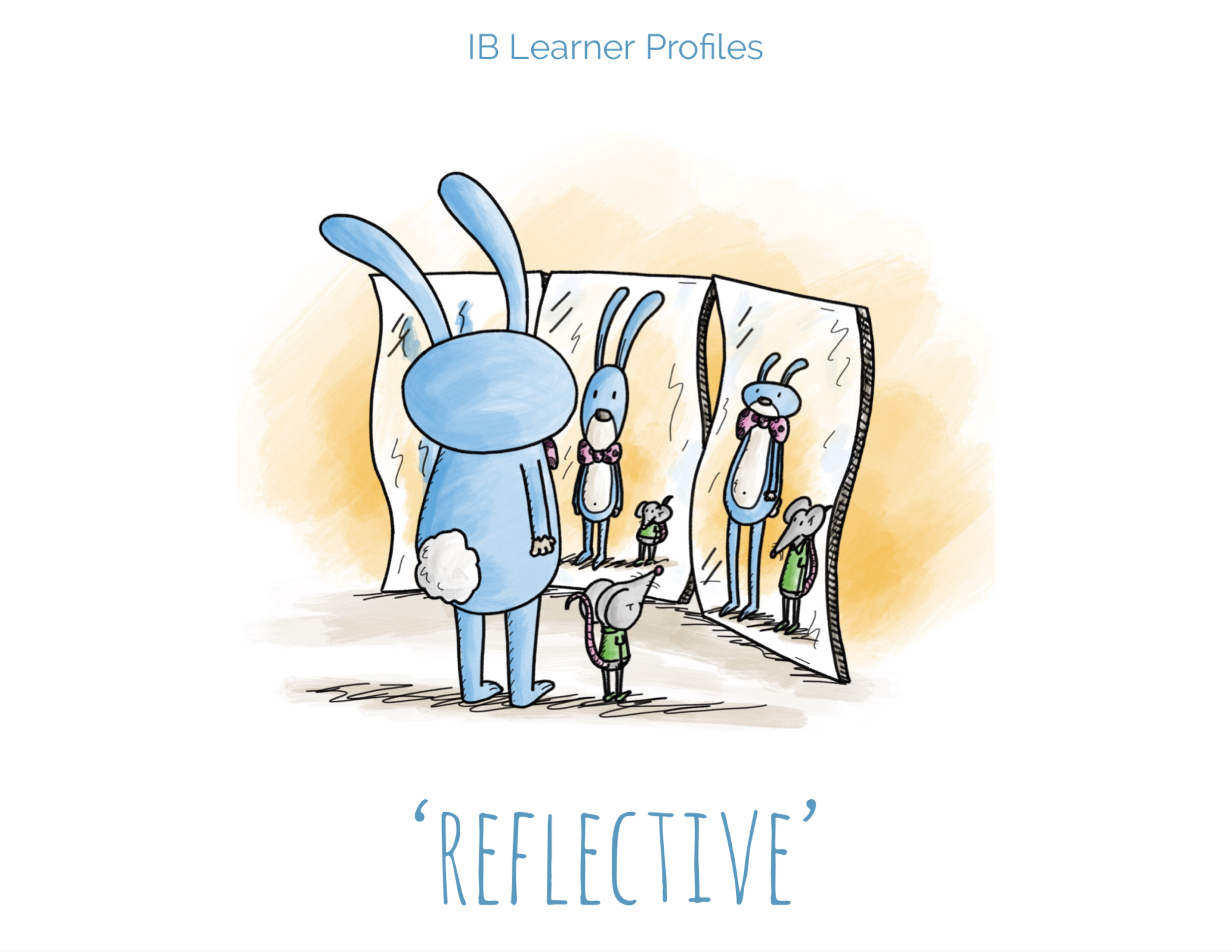
Reflective
With thoughtful consideration we are able to understand our strengths and weaknesses, and support our personal development.
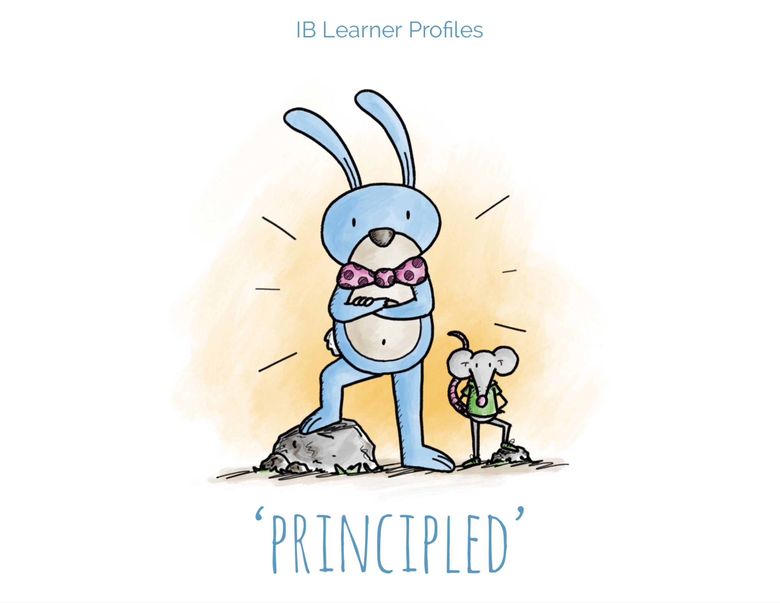
Principled
When we act with integrity and respect for ourselves and the people around us, we create a better world.

Communicators
Clear, concise, and reaching to the heart of the subject; good communication is essential to a positive exchange of ideas.

Open-Minded
Being ‘open minded’ means considering other perspectives, cultures, and beliefs, and allows ourselves to grow from them.

Risk-Takers
Taking risks is essential for moving beyond our comfort zones, gaining new insight, and foster courage.

Thinkers
With thoughtful consideration and creative thinking, we can approach complex problems and make reasonable and ethical decisions.

Caring
By being respectful, compassionate, and empathetic, we can have a positive effect on the world and the people around us.

If you’re an IB teacher and would love to print a set of these posters for your classroom, these and other posters can be found here - IB Learner Profile Posters
Library Finds - part 2
Picture books can take you on a journey. They can make you laugh, they can make you cry. They can show you something about the world around you, or help you discover something beautifully simple in a complex world.
As a picture book author, an illustrator, and a father of two young kids, I’m constantly coming home with stacks of books from my local library, and I would love to share with you some of my recent finds.
Magic Candy
written by Helena Baek, illustrated by Sophia Bowman
Magic Candy was recommended by a fellow parent. This one is a great example of how weird and wonderful picture books can be - a young boy buys a bag of mysterious candy from a store, and discovers that each candy he eats allows him to hear the hidden language of things around him, whether it’s a pet, an inanimate object, or a voice from the past. The claymation illustrations are undeniably striking, adding to the strangeness of the book’s concept, and making it all the more memorable.


Windows
written by Julia Denos, illustrated by E. B. Goodale
If you ever glance at lit up windows on a quiet evenings and wonder about the stories taking place inside of them, then this book is for you. Windows takes place in the final hours of the day, as we follow a boy taking his dog on a contemplative walk around his neighborhood. The illustrations beautifully compliment the character’s thoughtful journey.


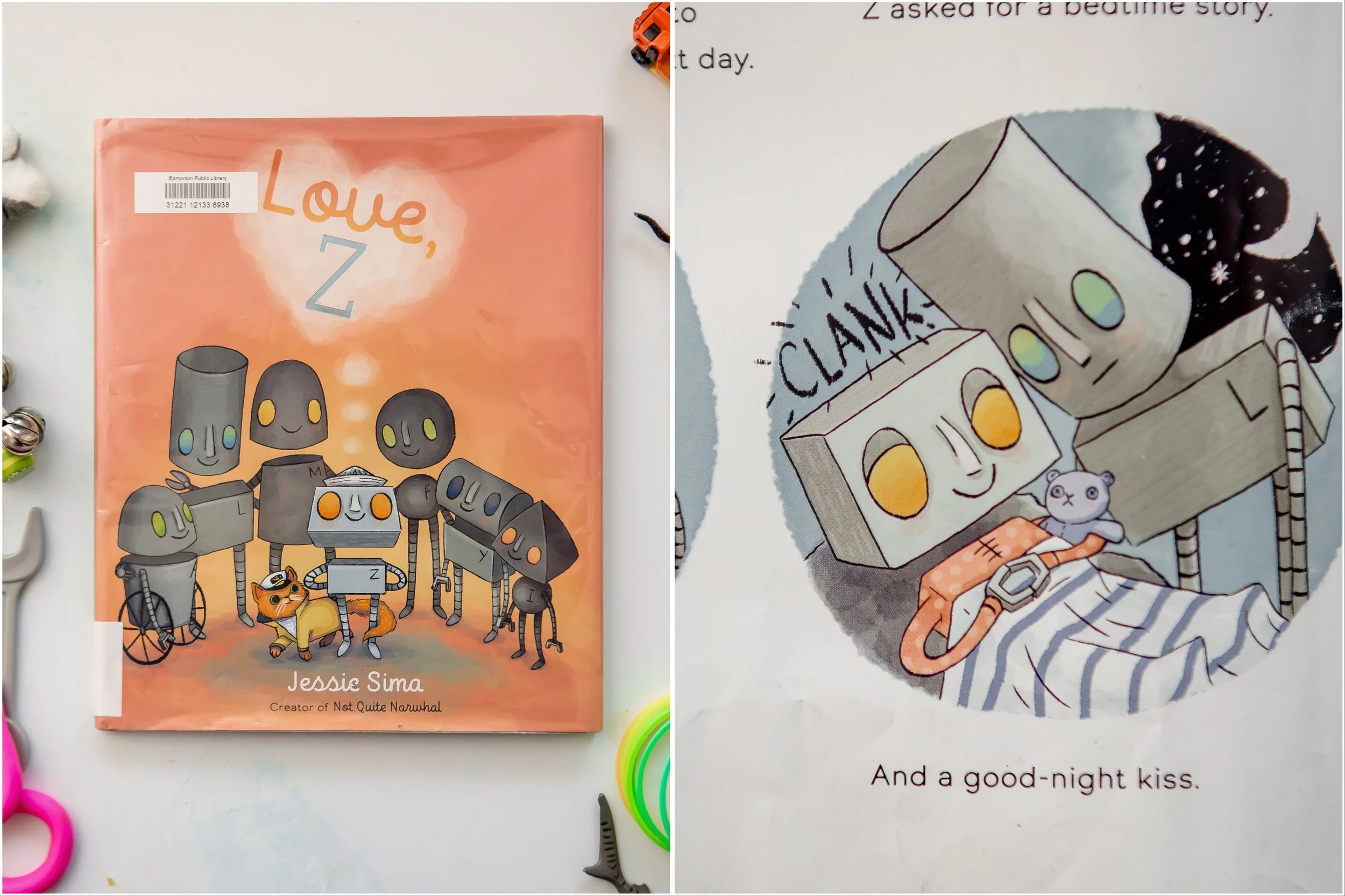
Love, Z
written and illustrated by Jessie Sima
This is another book that is fun to read and fun to look at. After discovering a long forgotten message in a bottle, a young robot named Z sets off on a journey to learn what love is. He quickly meets a helpful kitty, and the two sail off together. The book is filled with fun little details, like the letters of Z’s family, and the sailor cat settling into a new home. As an added bonus, to this day my daughter affectionately clanks head with me every night when I tuck her in.

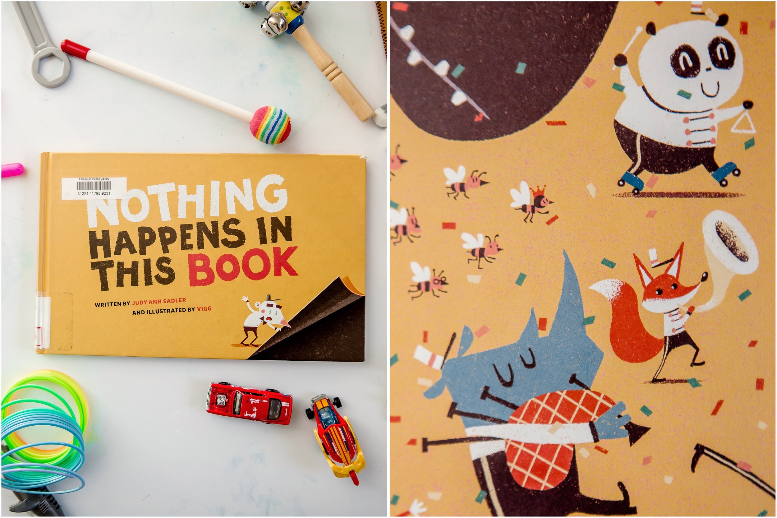
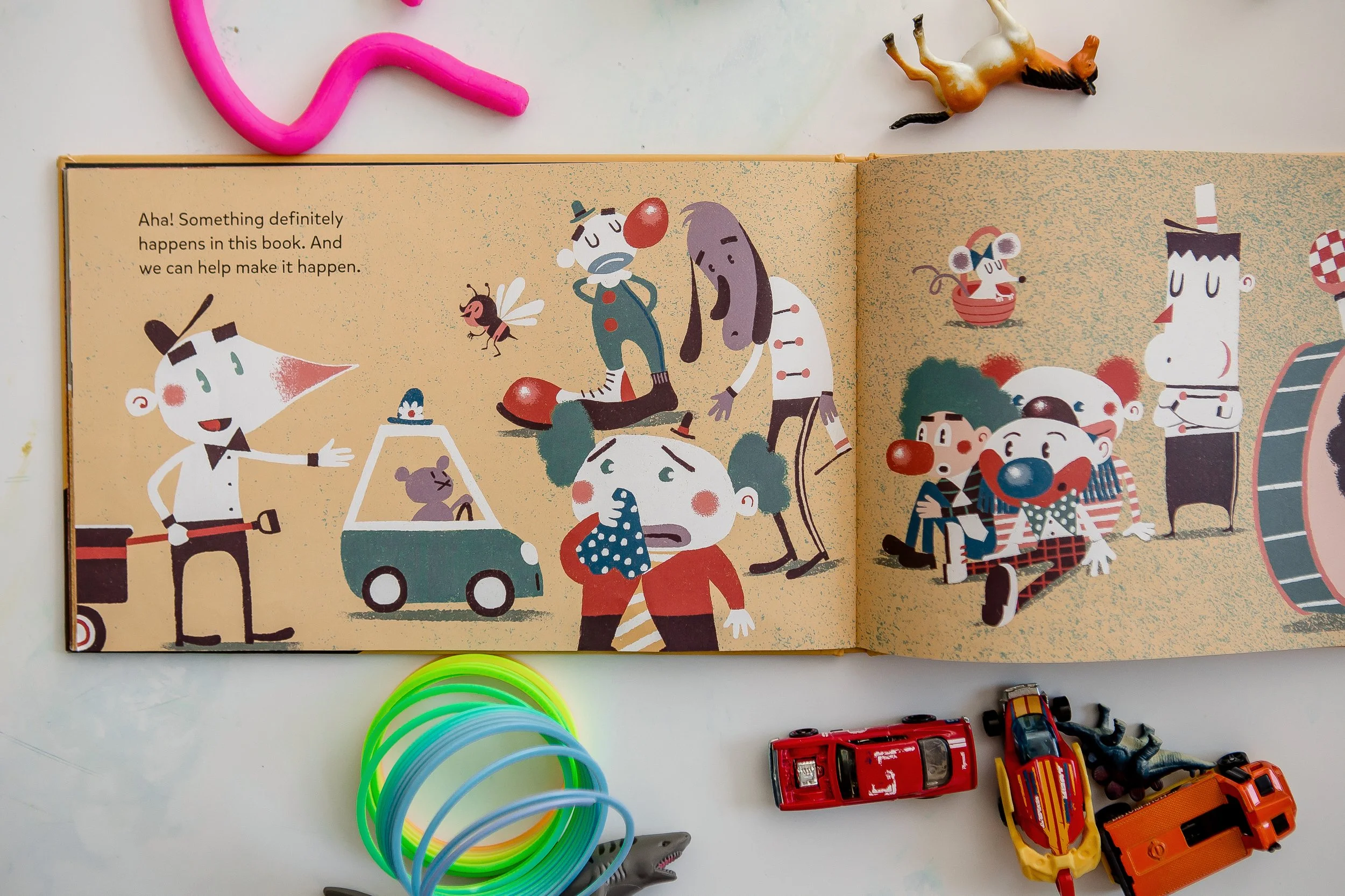
Nothing Happens in This Book
written by Judy Ann Sadler, illustrated by Vigg
You can’t help but be pulled into this book. It self admittedly starts off pretty boring, but we join the main character as he starts ti suspect that something (spoiler alert), does indeed happen in this book. This book is yet another example of wonderful variety of great illustrations and story structures that can be found in picture books.
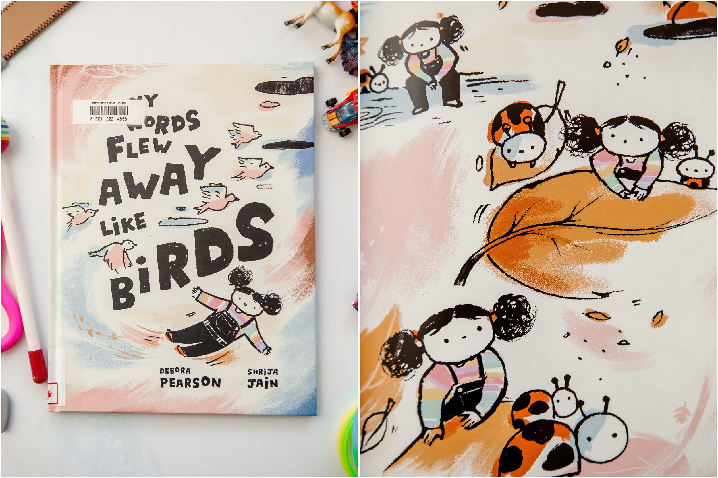
My Words Flew Away Like Birds
written by Debora Pearson, illustrated by Shrija Jain
I absolutely love the illustrations in this book about a young girl who has recently moved to another country. We see her perspective as she explores her surroundings, but struggles with language barrier of her new home. It’s a wonderful and whimsical look into a child’s perspective.

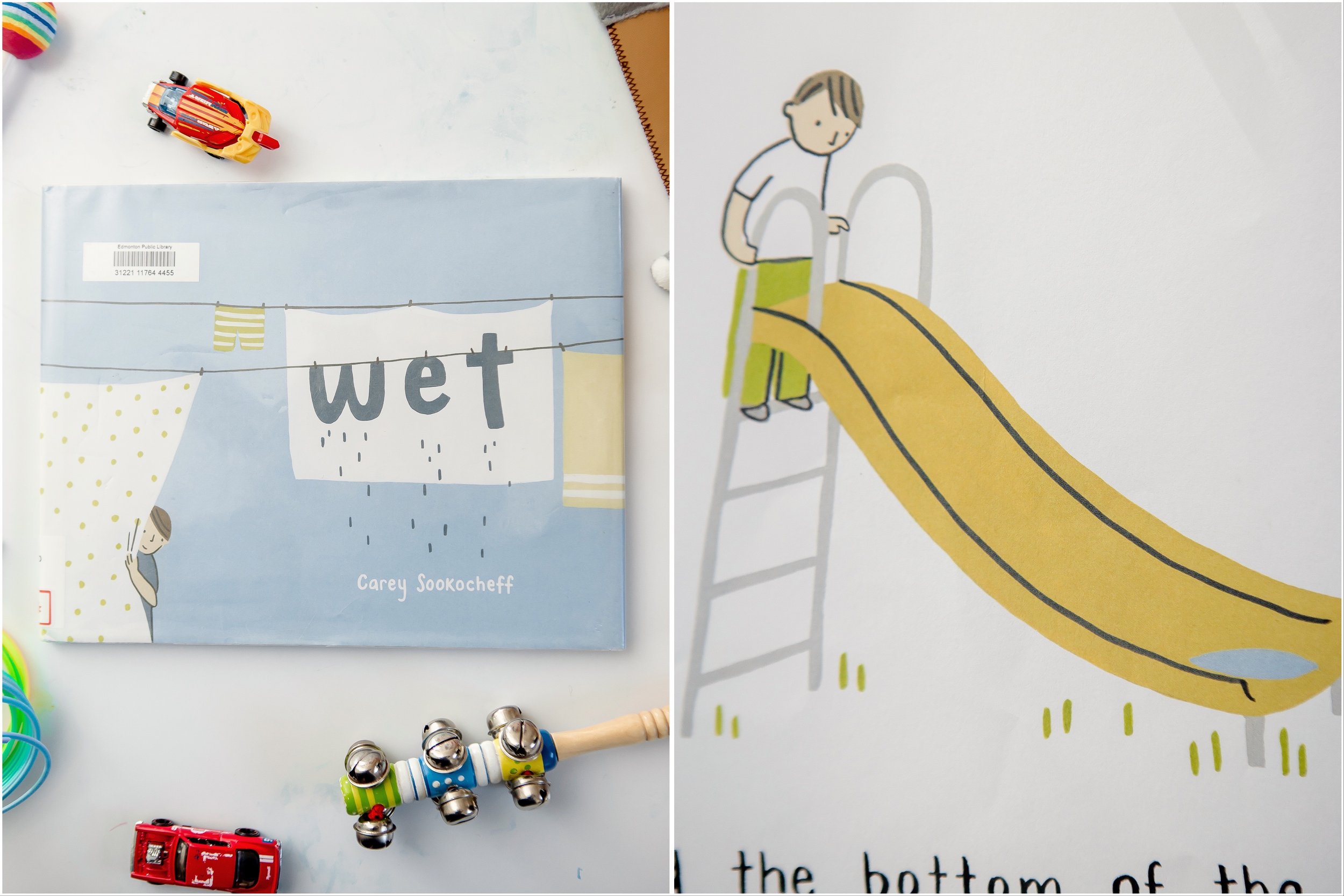
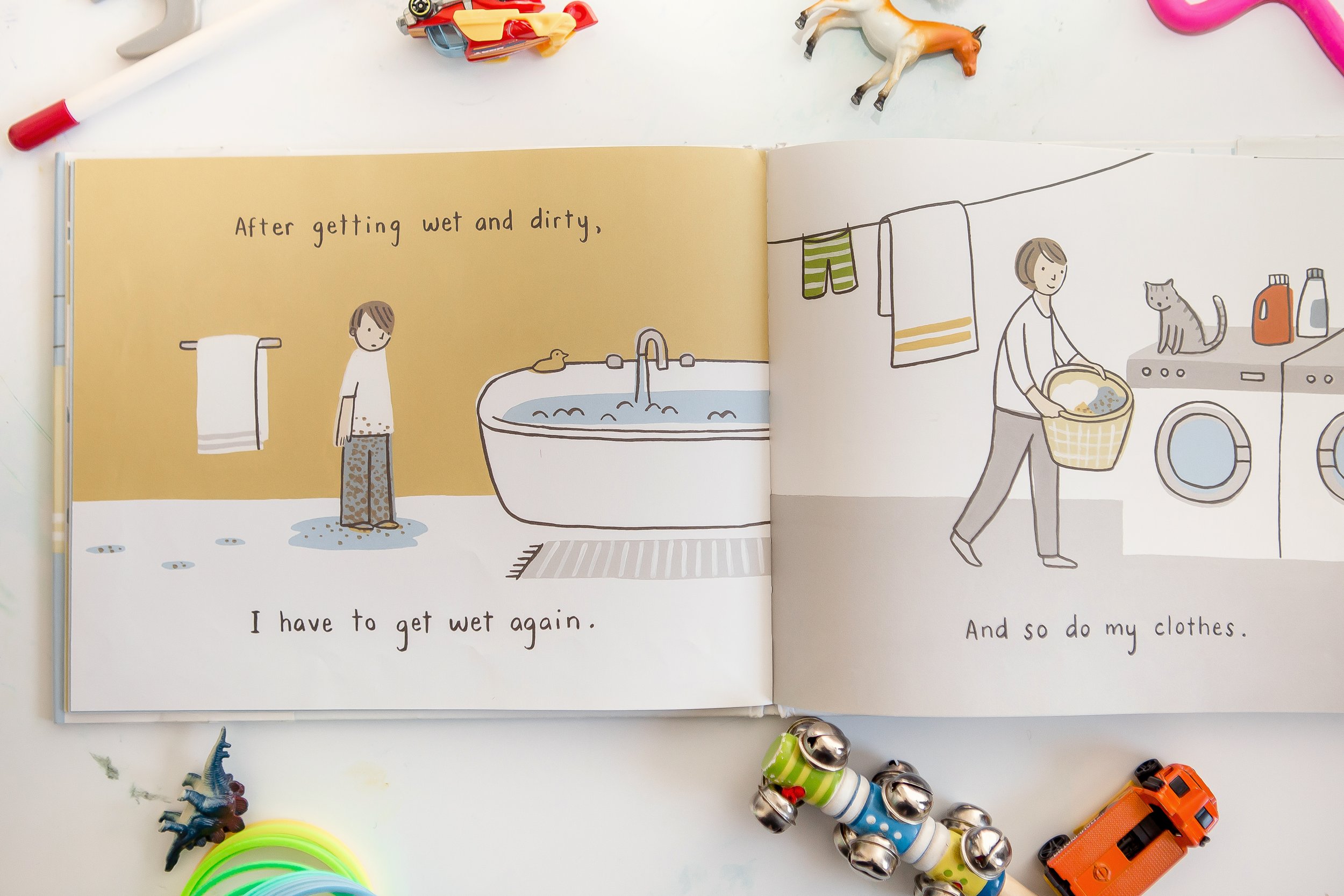
Wet
written and illustrated by Carey Sookocheff
I love that pictures don’t always have to have a deep moral lesson, sometimes they can just explore a topic that younger kids are still becoming familiar with. This book explores the simple concept of ‘wet’, brought to life with adorably simple illustrations (I especially like the cover).
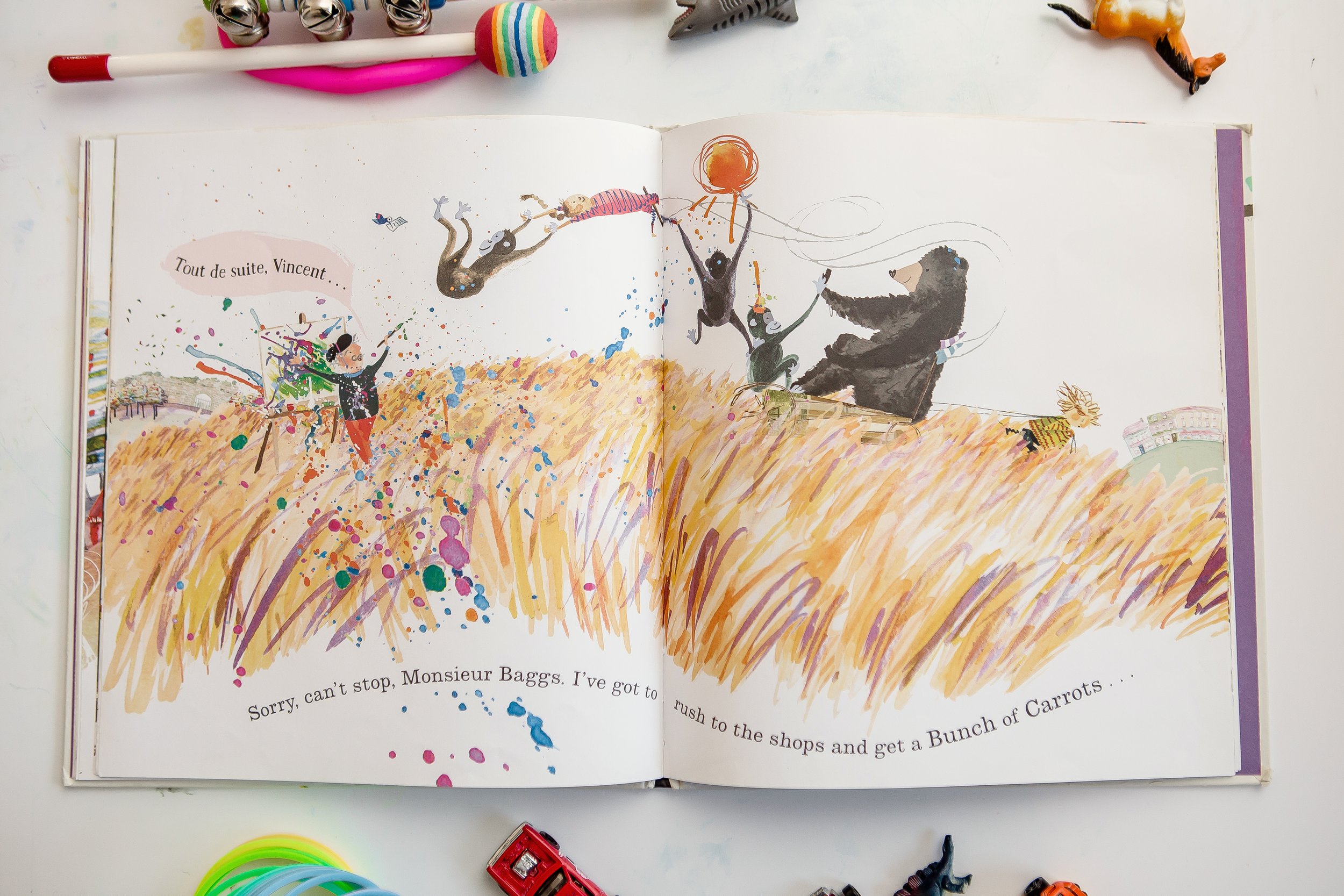
Chimpanzees For Tea
written and illustrated by Jo Empson
A boy’s trip to the market becomes increasingly absurd as he misremembers the items that his mother asked him to pick up. With the playful rhymes, fast paced text, and expressive illustrations, Chimpanzees For Tea is fun to read.

What Every Artist Website Should Include

I’m in the process of updating my artist website, so I did something that I rarely do; researched.
I do different things as an artist, such as writing books, illustrating, and doing photography, and though I could have a different website for each of these (which is what I did before), it is simply too much to manage. I still have my professional photography website (www.housestoriescanada.com), but I wanted my personal artist website to an online where all of my other work can live.
After scouring the internet for tips and advice, I’ve curated a list of everything that I think applies to me.
But First: Why Have a Website
Why does an artist even need a website? If you create art as a hobby, then having a website may not be important, but there are dozens of reasons why having one can be necessary to getting your work infant of an audience.
To have a presence - he first thing every artist needs to do before having an audience is to exist.
To have an online home for your art - a website can be a great place for the things you do can come together with images, words, and context.
To be reachable - because no one owns a phonebook anymore
To be relevant - we are constantly growing as artists, and a website is place where that should reflect that
To show credibility - because every professional needs a website

General Guidelines
Throughout my research, there are a few general principles for artist websites that came up again and again:
It should be clear and concise
Visitors should immediately have an idea who you are and what your art looks like
It should be easy to navigate
Art is subjective, its creation is often messy, and an artist’s mind is often in strange places, but having a central understanding of what you do and why it’s worth seeing is a great start at communicating your work to an audience in a clear and effective way. That doesn’t have to mean that you peel the mystery off of your art, you just need to present the gist of it in a cohesive way.
Menu Options
As mentioned, an artist’s website should be easy to navigate, which means the menu options should be minimal and intuitive. There are a few must-have pages:
Home page - this is the face of your website. Most likely it’s the first page that people will see, and it’s the place that they will form their first impression of you and your work, or at least be intrigued enough to dig a bit deeper. Like the rest of your website, it should be clean, and to the point, containing a title, an image, and your website's menu.
Work/Portfolio - this is where you get to show off your best work. It may be tempting to showcase everything you’ve ever done, especially if you’re just starting out, but this is an opportunity to curate your art and show off your best self. Generally your work should be organized into series of related themes. In any gallery, a good number of pieces to shoot for is 10-30. A brief description of each series will give context to your audience. For myself I have a separate page for photography, illustrations, and book, each divided into smaller, unified galleries.

About Page - let people get to know you. If you’re like me, this is the hardest thing to write. You’ll have to say nice things about yourself in a modest, but flattering way. You will probably want to mention some of your credentials, some of your achievements, but also make sure that your personality shines through. You might also want to include an ‘artist statement’ (a little blurb about your work), and you’ll definitely want to include a cool looking picture of yourself.

Contact Page - assuming you want to people to contact you, this is essential
Blog - this is my favourite part of a website. You can share information, show recent work, share some behind-the-scenes, or whatever tickles your fancy. There are an endless number if things that you can blog about that shows off your work, expertise, and personality. I’m so excited about blogs that I might write a separate blog post about them.
Social Media Links - whether you’re on Instagram, Twitter, FlipFlop, or Glurb, let people know where they can follow you.
Bonus Pages
Press Page - you can build on your credibility by showing all of the great things that has said about you in the media9
Store - obviously if you sell things this is the place to do it, whether you do it through your website or if it links to a serrate online shop.
Newsletter Opt-In - I love seeing examples of good newsletter. If you have a newsletter, let me know where I can opt-in
In Conclusion
Above all, your website should be reflection of you. It is an extension of your work, or at the very least, it is the package in which you and your work are presented to the world. It doesn’t have to be flashy, but it should be nice enough to make people want to stay.
By the time you are reading this, hopefully I will have finished updating my website, and it will be a gorgeous example of what a good artist website looks like. If you have any advice of your own, I would love to hear from you.

Welcome to the Beef Blog
it's a fun place

-
2024
- Jul 24, 2024 32 Illustrated Kids Jokes Jul 24, 2024
- Jun 19, 2024 My Favourite Picture Book About Death Jun 19, 2024
- Apr 3, 2024 School Writing Workshop: Moon Trees Apr 3, 2024
- Mar 27, 2024 School Writing Workshop: The Amazing Tube Mar 27, 2024
- Mar 20, 2024 School Writing Workshop: The Last Page Mar 20, 2024
- Jan 14, 2024 My First Colouring Wall Jan 14, 2024
-
2023
- Dec 29, 2023 Wings of Wisdom: IB Learner Profile posters for St. John's School Dec 29, 2023
- Dec 29, 2023 Festive Fables Vol.1 Dec 29, 2023
- Aug 2, 2023 The Importance of Story Writing for Ages 4-6 Aug 2, 2023
- Mar 19, 2023 Lunchbox Jokes Mar 19, 2023
- Mar 19, 2023 The IB Learner Profile Classroom Posters Mar 19, 2023
- Feb 1, 2023 Library Finds - part 3 Feb 1, 2023
-
2022
- Jul 2, 2022 IB Learner Profiles Posters Jul 2, 2022
- May 29, 2022 Library Finds - part 2 May 29, 2022
- Apr 24, 2022 What Every Artist Website Should Include Apr 24, 2022
- Mar 19, 2022 How Forest Animals Can Use Blogging for Business Mar 19, 2022
- Feb 22, 2022 Library Finds - part 1 Feb 22, 2022
- Feb 19, 2022 LinkedIn Feb 19, 2022
-
2018
- Oct 26, 2018 Morning Tea Oct 26, 2018
- Oct 26, 2018 the International Baccalaureate - Key Concepts posters Oct 26, 2018
- Oct 25, 2018 the IB Approaches to Learning Oct 25, 2018
- Oct 19, 2018 Happy Birthday Maddy Oct 19, 2018
-
2017
- Oct 19, 2017 Bees! Oct 19, 2017
- Mar 27, 2017 Eastside Flea (my first market experience) Mar 27, 2017
-
2016
- Dec 27, 2016 the 4th Annual Land of Le Beef Christmas Advent Calendar Dec 27, 2016
- Oct 26, 2016 Maddy's Favourite Toys Oct 26, 2016
- Sep 24, 2016 IB Learner Profile Posters Sep 24, 2016
- Aug 22, 2016 Dear Diary... Aug 22, 2016
- Mar 23, 2016 Goldilocks & the Three Bears Mar 23, 2016
- Mar 4, 2016 Three Blind Mice Mar 4, 2016
- Mar 3, 2016 Bob the Rabbit Mar 3, 2016
- Feb 29, 2016 Storybook Sketches Feb 29, 2016
- Feb 8, 2016 Year of the Monkey Feb 8, 2016
- Feb 1, 2016 A Crab with a Straw Feb 1, 2016
- Jan 8, 2016 Dear Diary: Chapter 5 Jan 8, 2016
-
2015
- Dec 25, 2015 The 3rd Annual 2015 Land of Le Beef Christmas Advent Calendar: Hollywood Edition Dec 25, 2015
- Nov 25, 2015 Dear Diary: Chapter 4 Nov 25, 2015
- Oct 22, 2015 Another Six Random Things Oct 22, 2015
- Oct 19, 2015 the Adventures of Maddy and Alphapup Oct 19, 2015
- Oct 8, 2015 Six More Things Oct 8, 2015
- Oct 8, 2015 the Buildings of Hong Kong Oct 8, 2015
- Sep 20, 2015 Six Things Sep 20, 2015
- May 5, 2015 Doodles & Stuff - a Javier Perez Inspired Class Project May 5, 2015
- Apr 17, 2015 Octographer Apr 17, 2015
- Apr 16, 2015 32 Bottles of Beer | part 2 Apr 16, 2015
- Mar 30, 2015 Hey Diddle Diddle Mar 30, 2015
- Mar 5, 2015 What a Wonderful World Mar 5, 2015
- Feb 24, 2015 32 Bottles of Beer | part 1 Feb 24, 2015
- Jan 1, 2015 The 2014 Second Annual Land of Le Beef Christmas Advent Calendar: Classic Toys Edition Jan 1, 2015
-
2014
- Nov 24, 2014 It's Jibo! Nov 24, 2014
- Oct 31, 2014 It's a Halloween Spooktacular Oct 31, 2014
- Sep 26, 2014 Cartooning 101 Sep 26, 2014
- Sep 2, 2014 That's Not a Knife Sep 2, 2014
- Sep 2, 2014 The Couch and the Lamp Sep 2, 2014
- Aug 12, 2014 Research and Development Aug 12, 2014
- Jun 20, 2014 Coming Soon to a Womb Near You... Jun 20, 2014
- May 21, 2014 Mother's Day May 21, 2014
- May 2, 2014 A Fine Feathery Mess May 2, 2014
- Apr 3, 2014 Sizzling Apr 3, 2014
- Apr 3, 2014 Evernote Apr 3, 2014
- Mar 27, 2014 Broken Pig Mar 27, 2014
- Mar 26, 2014 When life gives you lemons Mar 26, 2014
- Mar 25, 2014 Every dog has its day Mar 25, 2014
- Feb 26, 2014 Breakfast Cereals Feb 26, 2014
- Feb 19, 2014 Under the Sea Feb 19, 2014
- Feb 14, 2014 A Very Beefy Valentines Day Feb 14, 2014
- Feb 6, 2014 Year of the Horse, 2014 Feb 6, 2014
- Feb 3, 2014 Horsing Around Feb 3, 2014
- Jan 23, 2014 Gratitude - Staedtler and Uni-Ball Jan 23, 2014
- Jan 17, 2014 the Beef Jan 17, 2014
-
2013
- Dec 25, 2013 Merry Christmas Dec 25, 2013
- Dec 12, 2013 Snowmen! Snowmen! Snowmen! Dec 12, 2013
- Dec 1, 2013 the first annual Land of Le Beef 'Christmas Advent Calendar' Dec 1, 2013
- Nov 28, 2013 a fish out of water Nov 28, 2013
- Oct 31, 2013 Halloween Monster Spectacular Oct 31, 2013
- Oct 7, 2013 birthday gecko Oct 7, 2013
- Sep 30, 2013 Woodland Classroom Animals Sep 30, 2013
- Sep 23, 2013 International Talk Like a Pirate Day Sep 23, 2013
- Sep 16, 2013 the Montessori Academy Sep 16, 2013
- Sep 9, 2013 me and my can-opener Sep 9, 2013
- Aug 26, 2013 woodland murals Aug 26, 2013
- Jun 9, 2013 art adventure day! Jun 9, 2013
- Jun 9, 2013 incoming Jun 9, 2013
- May 17, 2013 Yellow Brick Road May 17, 2013
- May 10, 2013 Awkward May 10, 2013
- May 6, 2013 dinner for two May 6, 2013
- Apr 30, 2013 a royal flush Apr 30, 2013
- Apr 29, 2013 send in the clowns Apr 29, 2013
- Apr 24, 2013 Rocky XIII Apr 24, 2013
- Apr 17, 2013 the 4 food groups Apr 17, 2013
- Apr 8, 2013 the thunder from down under Apr 8, 2013
- Apr 4, 2013 I love the smell of easter in the morning Apr 4, 2013
- Mar 24, 2013 hot potato Mar 24, 2013
- Mar 17, 2013 a st. patrick's day extravaganza Mar 17, 2013
- Mar 11, 2013 a fresh take on an old classic Mar 11, 2013
- Mar 6, 2013 what's new, pussy cat? Mar 6, 2013
- Mar 4, 2013 do the harlem shake Mar 4, 2013
- Feb 26, 2013 warm-hearted tickle machine Feb 26, 2013
- Feb 21, 2013 why can't we all just get along? Feb 21, 2013
- Feb 15, 2013 birthday buddies Feb 15, 2013
- Feb 8, 2013 chinese new year Feb 8, 2013
-
2012
- Dec 25, 2012 holiday special Dec 25, 2012
- Oct 31, 2012 spooooooky Oct 31, 2012